The contact page is where people come when they have questions.
If your visitors can’t find answers somewhere on your site, they’ll go to your contact page to ask you.
ANTICIPATE YOUR VISITOR’S QUESTIONS
Ideally, you’ll answer most questions on your home page (see 7 Things You Should Put On Your Website's Home Page and Why) but some answers might not fit there.
Put that info on your contact page.
It’ll be easier and faster for you and your visitor if you don't force them to email or call you to get an answer.
For example, if you own a coffee shop, people will want to know your address. Put it on your contact page.
You’re better off answering questions on your site once rather than answering 100 emails asking what time your store opens.
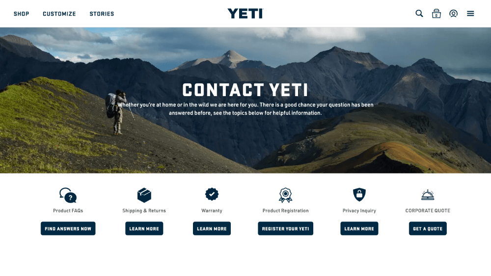
Here are some great ways to answer common questions that you can feature on your contact page:
- FAQ
- Blog Posts
- Resources
EXAMPLES
HOW ARE YOU BEST PREPARED TO ANSWER QUESTIONS?
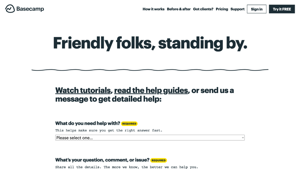
You can’t anticipate everything. There will always be an off-the-wall question that you didn’t see coming.
If your visitor can’t find the answer on your site, they’ll reach out and ask you.
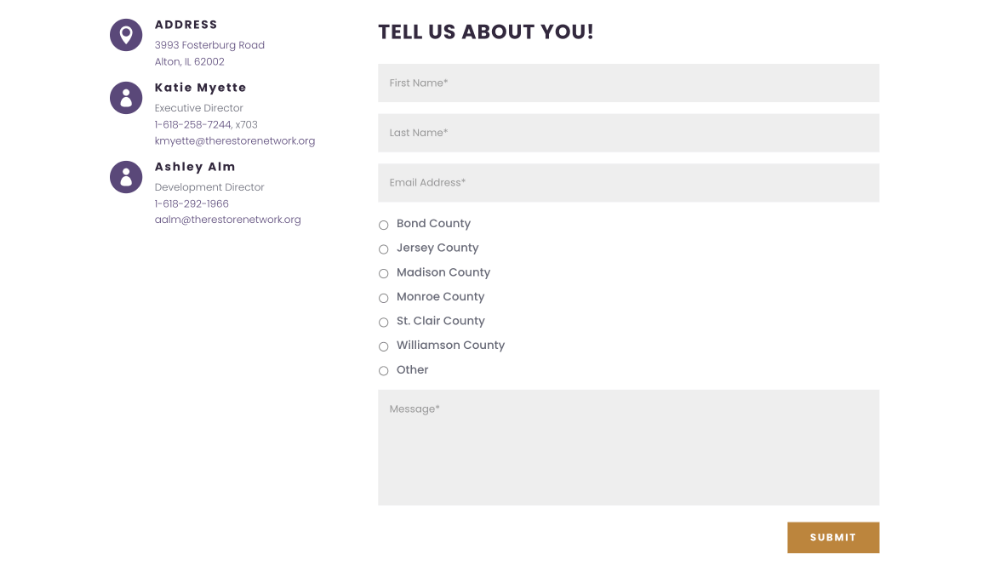
Everyone thinks they need a contact form on their website but not every site does.
What’s important is that you provide your visitors with easy avenues to getting comprehensive answers in the shortest amount of time.
For some people, a contact form works best. For others, a phone number or email address is all you need.
Only provide the contact information for methods of communication you want to use.
- Contact form
- Phone number
- Email address
- Chat widget
- Mailing address
EXAMPLES
WHY SHOULD PEOPLE CONTACT YOU AND WHAT WILL HAPPEN IF THEY DO?
Contact pages often suffer from the curse of knowledge.
This means that you’re so familiar with what you do and how you work that you forget other people don’t know.
Imagine the only thing on your contact page was a form and a heading that said: “Send Us a Message”. You know that message goes to Bob from sales and he takes a day to reply but your site’s visitors don’t know that.
People will not walk into a fog. If it’s not clear why they should do something or what will happen if they do, they will back out.
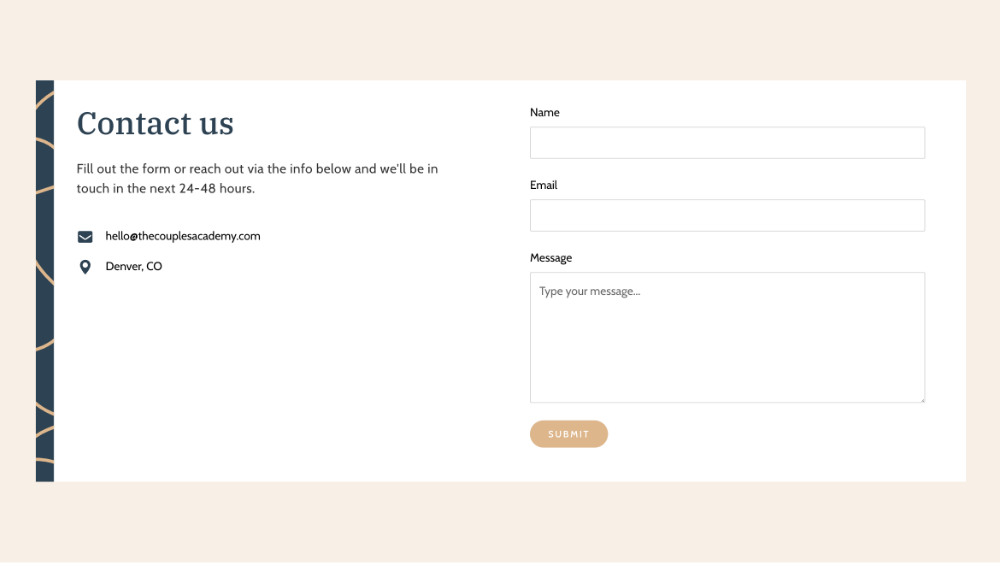
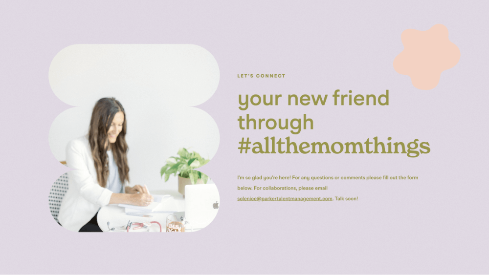
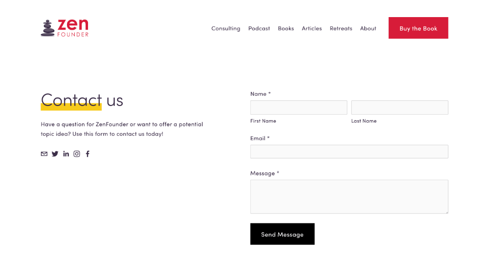
We need to explain what each contact method is for and what will happen when they reach out using that method.
Say something like this on your contact page:
“If you need us to clarify anything, please send us your questions using the form on this page. We will reply via email in 1-2 days. Or if you’re ready to book an appointment, click the button below.”
EXAMPLES
SHOW THEM WHO THEY’RE DEALING WITH
Some people’s questions will be more basic. For example: “Will I be talking to a real person or a bot?” Or “what does this store look like?”
Oftentimes, contact pages feel removed from reality. Like once you hit send, your message goes straight to an inbox that no one ever checks and you’ll never get a reply.
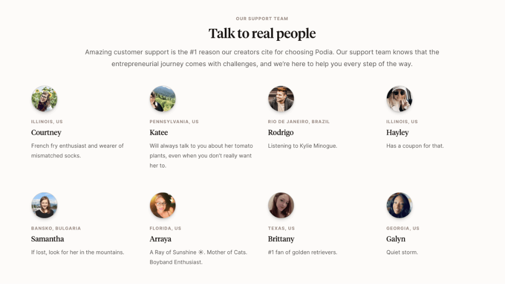
Including names and pictures of people whose job it is to respond to inquiries, gives your visitor confidence that someone will get back to them.
Pictures make things feel real, so when applicable, include them on your contact page.
EXAMPLES

KEEP THEM IN THE LOOP
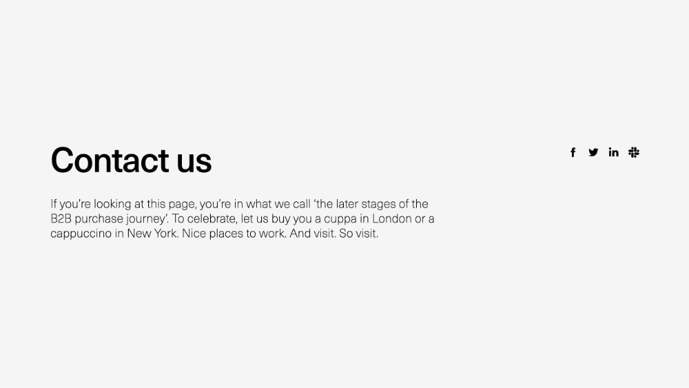
SOCIAL MEDIA & NEWSLETTERS
It’s possible visitors don’t want to contact you directly but just want to stay up to date with what you’re doing.
Links to active social media accounts like Facebook and LinkedIn or a newsletter signup form are great ways for visitors to be kept in the loop on what you’ve got going on.
THANK YOU PAGE
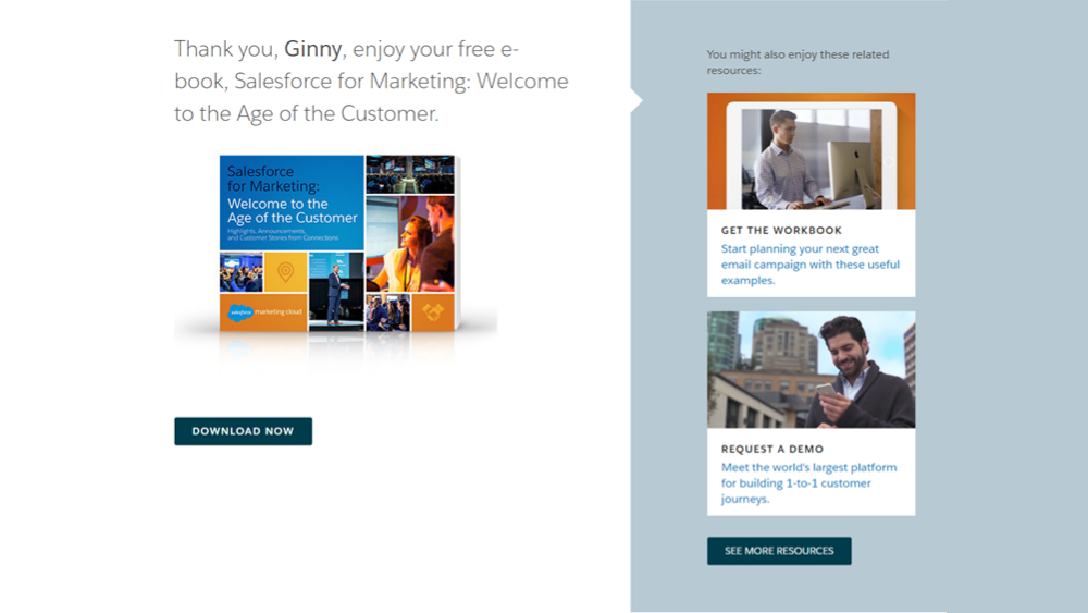
If you have a contact form, make sure it redirects visitors to a thank you page after they hit submit. Thank you pages are a great way to say you got their message and will be getting back to them soon.
On your thank you page, be sure to encourage your visitors to explore other parts of your site. Mention an ongoing promotion, place a button that links to another page, or show a few blog posts they might be interested in.
Eventually, your visitor will leave but hopefully, it’s not because they’ve run out of things to engage with on your site.
EXAMPLES
THAT’S EVERYTHING!
Don’t overthink your contact page.
It’s there to answer your visitor’s questions as efficiently and comprehensively as possible. That’s it.

